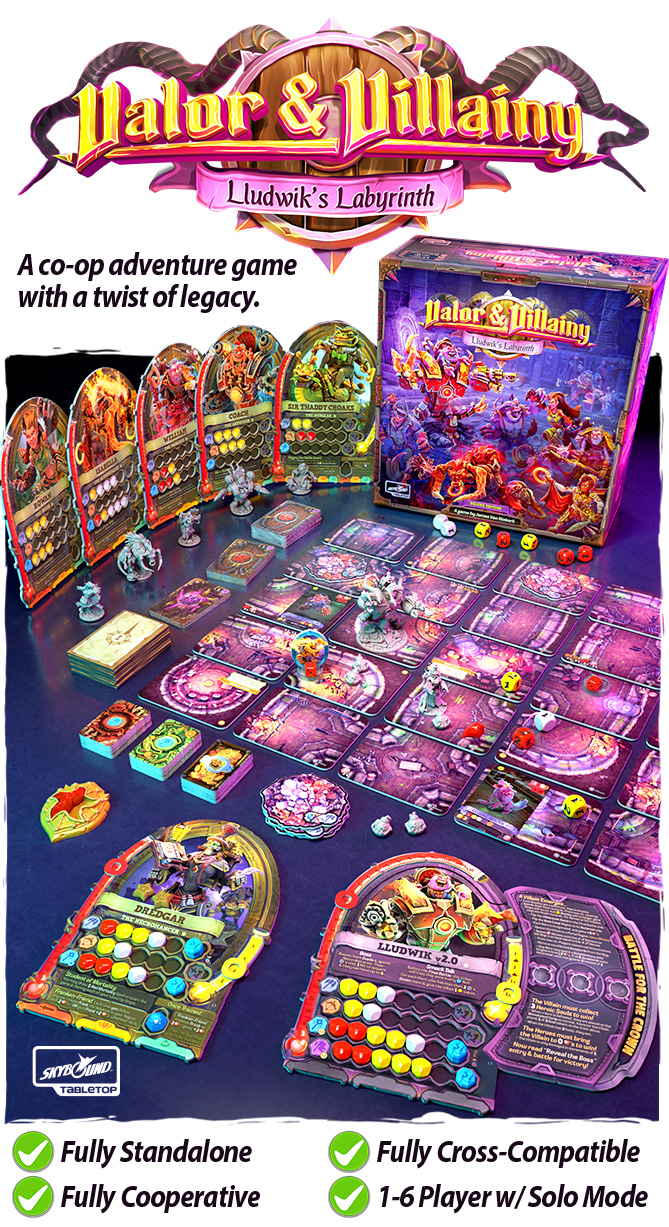
Jun 11 | 2021Designing a Labyrinth
The Labyrinth map was the very first concept I came up with when designing Valor & Villainy 2: Lludwik’s Labyrinth. In V&V 1, there was already a concept of open ground and difficult terrain, so I wanted V&V 2 to be set somewhere that could present some new challenges to navigate, without reinventing the mechanisms.
My Inspirations
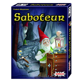
I don’t know what it is about it, but I have come back to examine Saboteur many times, because I just love the way the map builds in this game. It’s so simple and intuitive, and it creates a really cool visual tunnel!
The First Kick at the Can
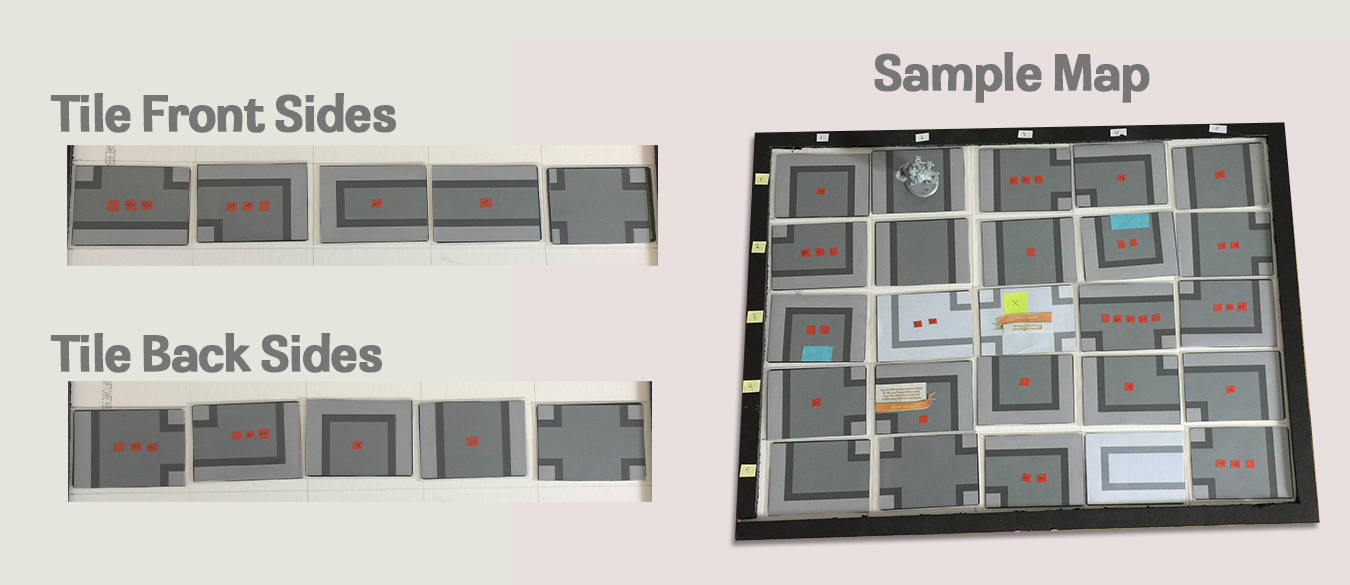
Right off the hop I created some map tiles in some standard shapes that could connect, and made a simple rule to navigate Scouting:
Flip tiles until you find something that can fit. Rotate it however you like.
This wound up being a great mechanism!
- The -if it fits you must place it- aspect made the map sometimes throw you unexpected curve balls!
- The -rotate it how you like- aspect gave players enough agency to make fun navigation decisions.
I quickly realized that each tile type only needed 1 variation to make every possible turn direction! This was a huge design boon because it meant that if the tiles were double-sided, you could flip or rotate a 3-way tile and know that it could be placed in any orientation you could imagine!
Problem Solving
The premise of the system worked! But the challenge was balancing it.
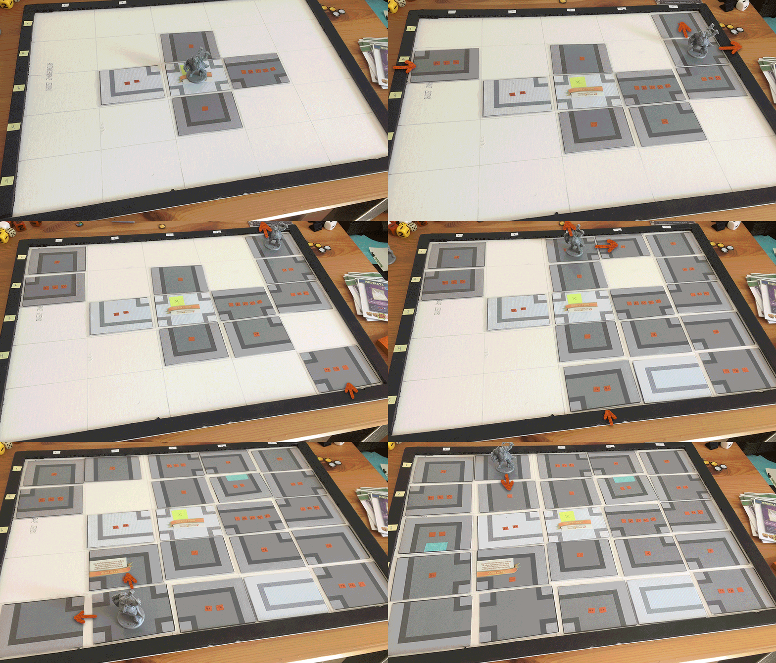
I set up a simple board so that I could begin rapid testing to search for what would feel right. I really feel like getting an idea to the table and playing it by yourself is a great way to start testing a system.
I learned by adding and removing certain tile types, it really effected exploration. Too many 4-way tiles created a sprawling map, too many dead ends were frustrating. But having dead ends come up now and then and having the map pac-man wrap around from edge to edge, really did push the sense of being lost in a labyrinth, which was a theme I ran with for the entire game!
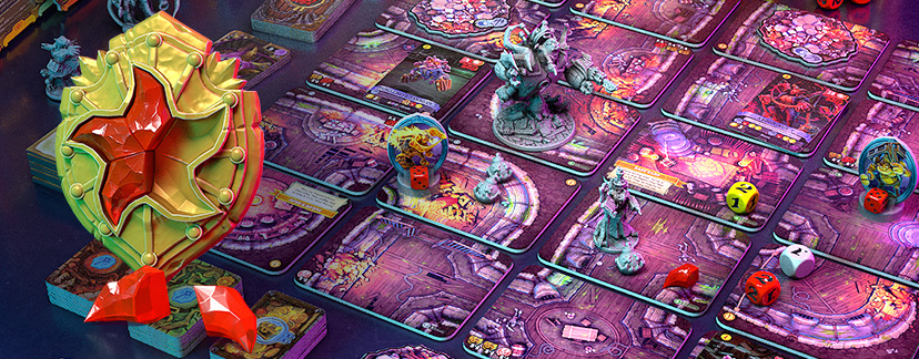
Then I created Sunshards. These were a carrot in the dark which would incentivize you to go exploring, but more importantly they made you need to get to specific locations on the map, which created a maze challenge. And it worked really well!
Working the Artwork
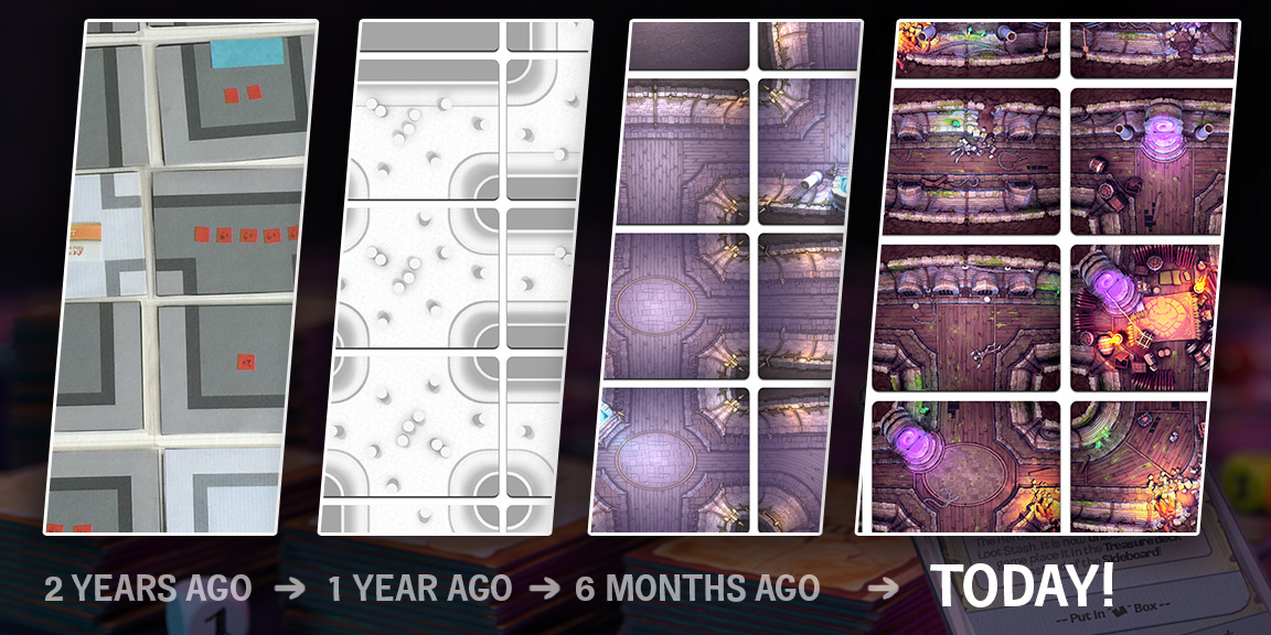
One of the things about a top down map, especially one that needs to get rotated, is that it can tend to look flat. Going true top down eliminates all of the depth in your artwork. I spent some time experimenting with this, using 3D software to help me get a very subtle fish-eye perspective on my tiles which could showed off the walls and sides of objects while still lining up at any rotation. I think the result has some pretty interesting depth to it for a modular top-down map!
Thanks for reading my little diary about map tiles! I hope you enjoyed.
What do you think of the map design? What is your favourite map in a game?
Let me know in the comments below!
This post is about Valor & Villainy: Lludwik’s Labyrinth, a 1-6 player co-op adventure game coming to Kickstarter in one week, June 22nd!
